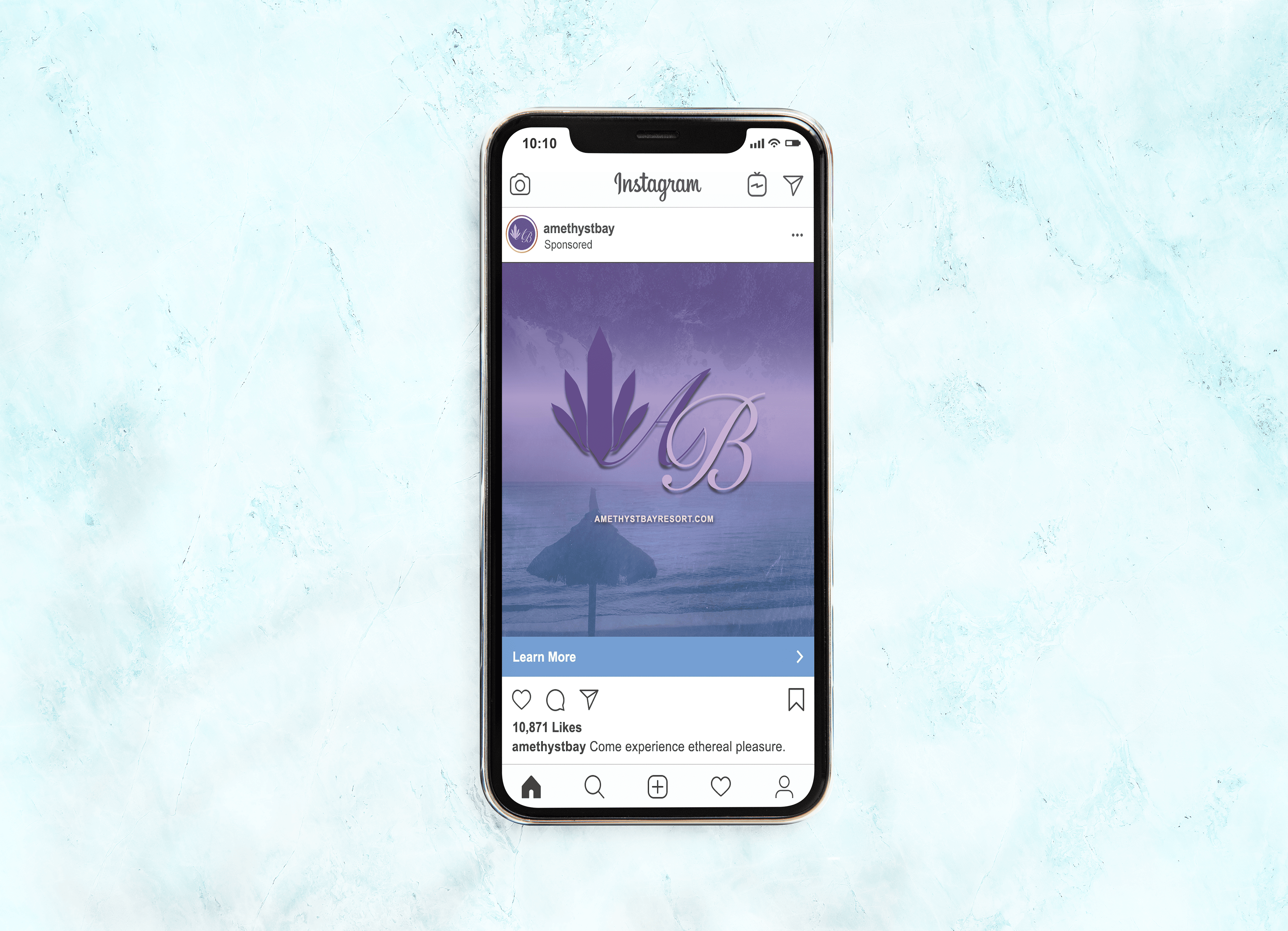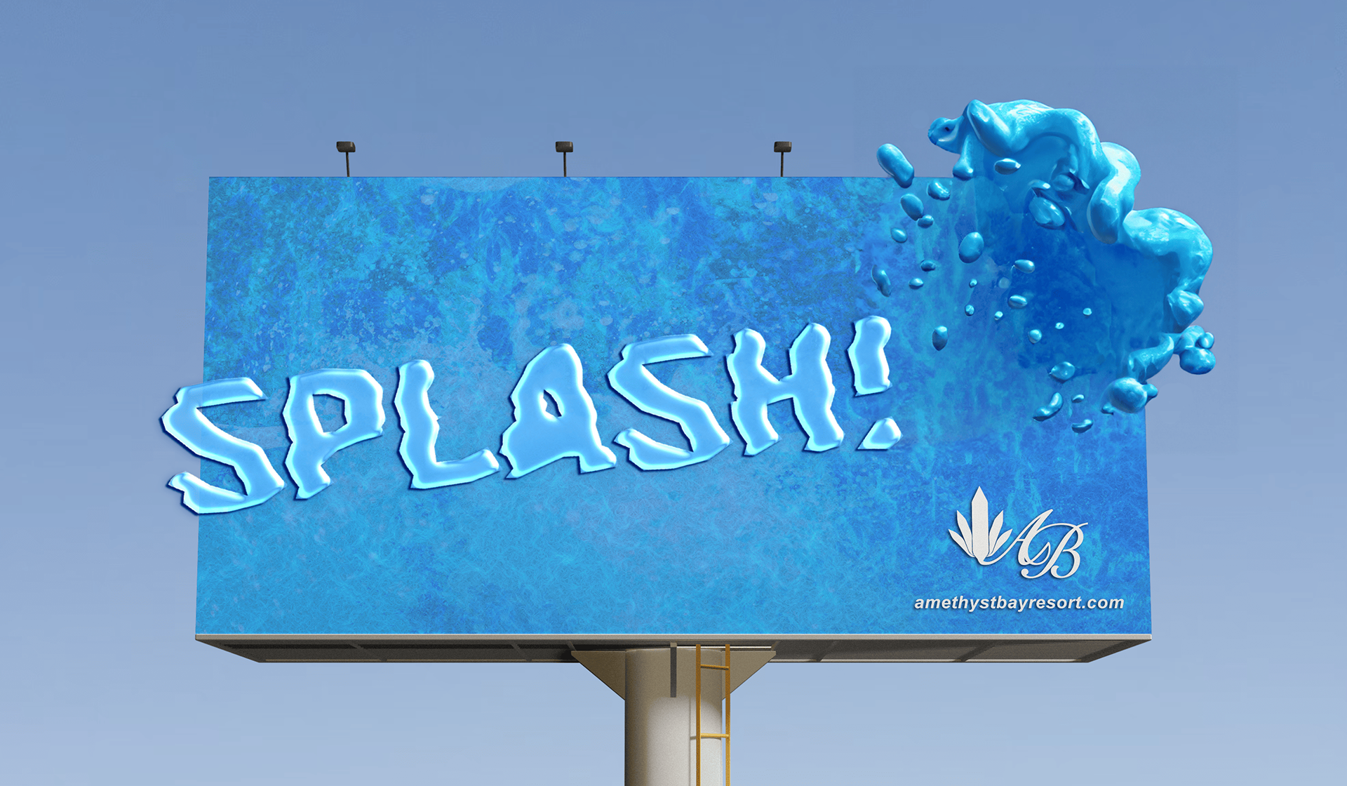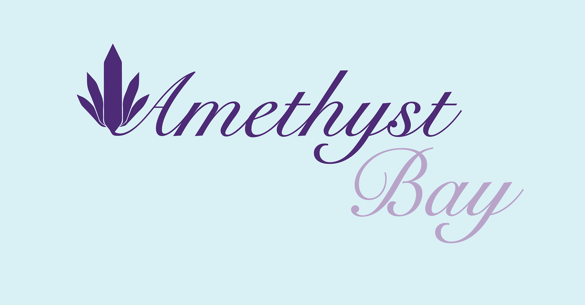
AMETHYST BAY
Amethyst Bay Resort and Spa is a conceptual tropical resort located within the St. Virgin Islands. They have a spa and resort on one side of the island and a new water park oasis on the other side of their resort. They have luscious tropical scenery surrounding the islands and are known for their extravagant nature and the amazing services.
GOALS
Amethyst Bay's goal and mission is to market itself as a luxurious resort that is affordable for couples looking for a nice getaway or families searching for a fun vacation destination for everyone to be able to enjoy all of the luxuries that Amethyst Bay has to offer. They want their guests to relax and leave the resort feeling rejuvenated after indulging in such a lavish and vibrant atmosphere.
TARGET DEMOGRAPHIC
•Couples searching for romantic, affordable getaways
•Families seeking fun, enjoyable vacations suitable for all ages
•Travelers interested in indulging in luxury experiences and atmosphere
•Seeking customers appreciative of vibrant, lavish amenities and environment
•Income levels varying from middle to upper-middle-class households with disposable income
ROLES
Logo Design
Brand Design
Print Design
UI Design
LOGO REDESIGN
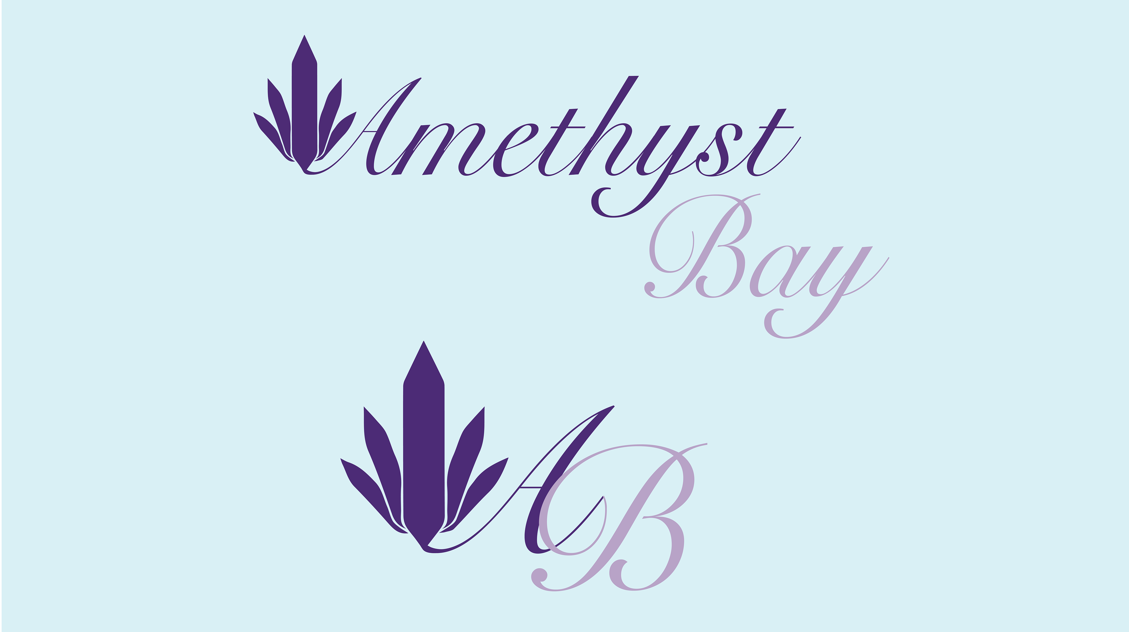
OLD
The old logo displayed two different typefaces and the addition of the wording “Resort & Spa” directly under Amethyst Bay. The old logo felt too cluttered and all of the different elements contrasted with each other instead of complimenting one another.
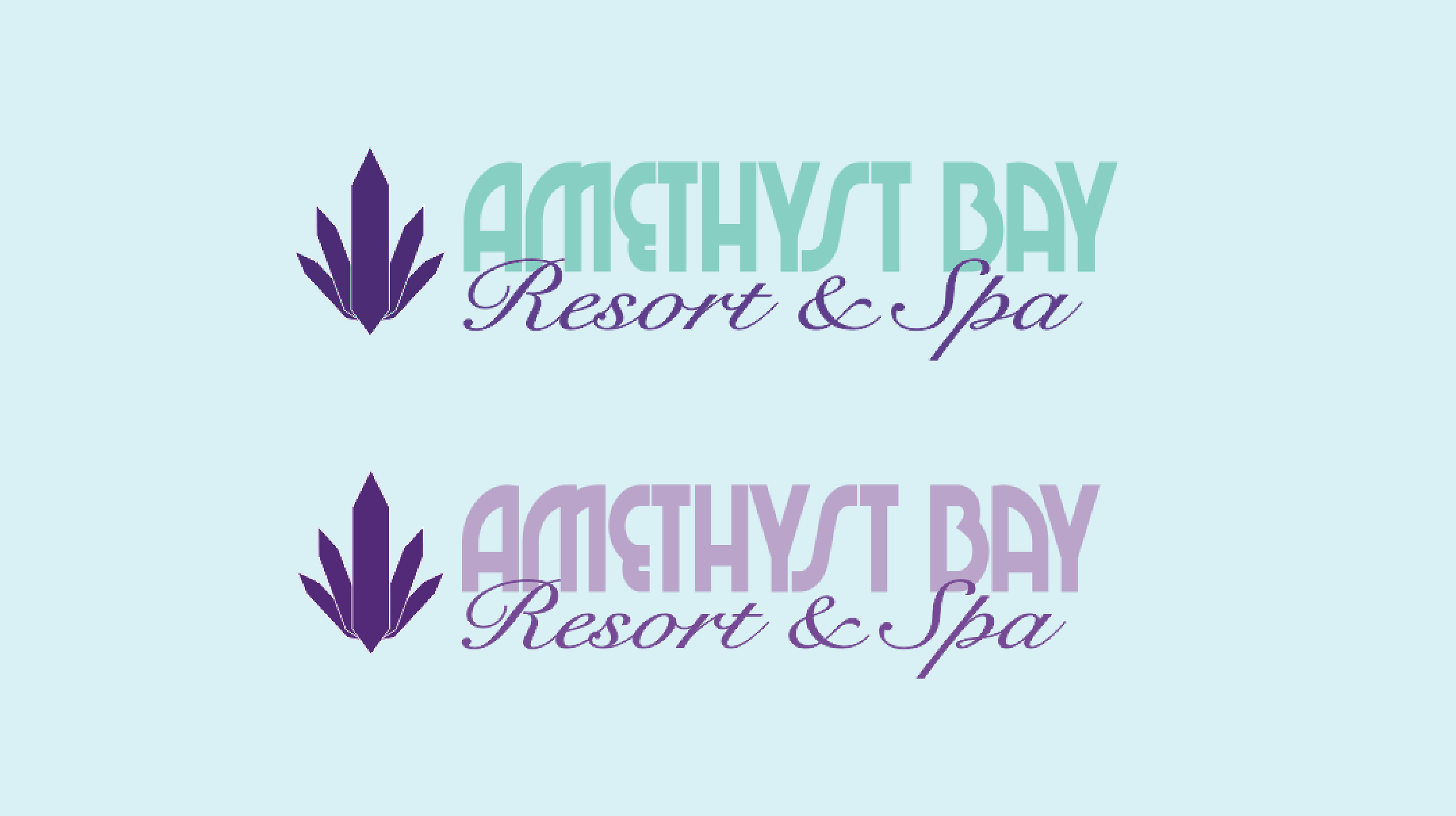
NEW
The new logo features the logo in one single typeface and provides more clarity and is less contested in terms of space for the wording. It also provides more of a highlight for the Amethyst gem icon. The icon features a unique twist on the initials of Amethyst Bay and has the Amethyst gem icon stand out much more as the centerpiece of the logo.
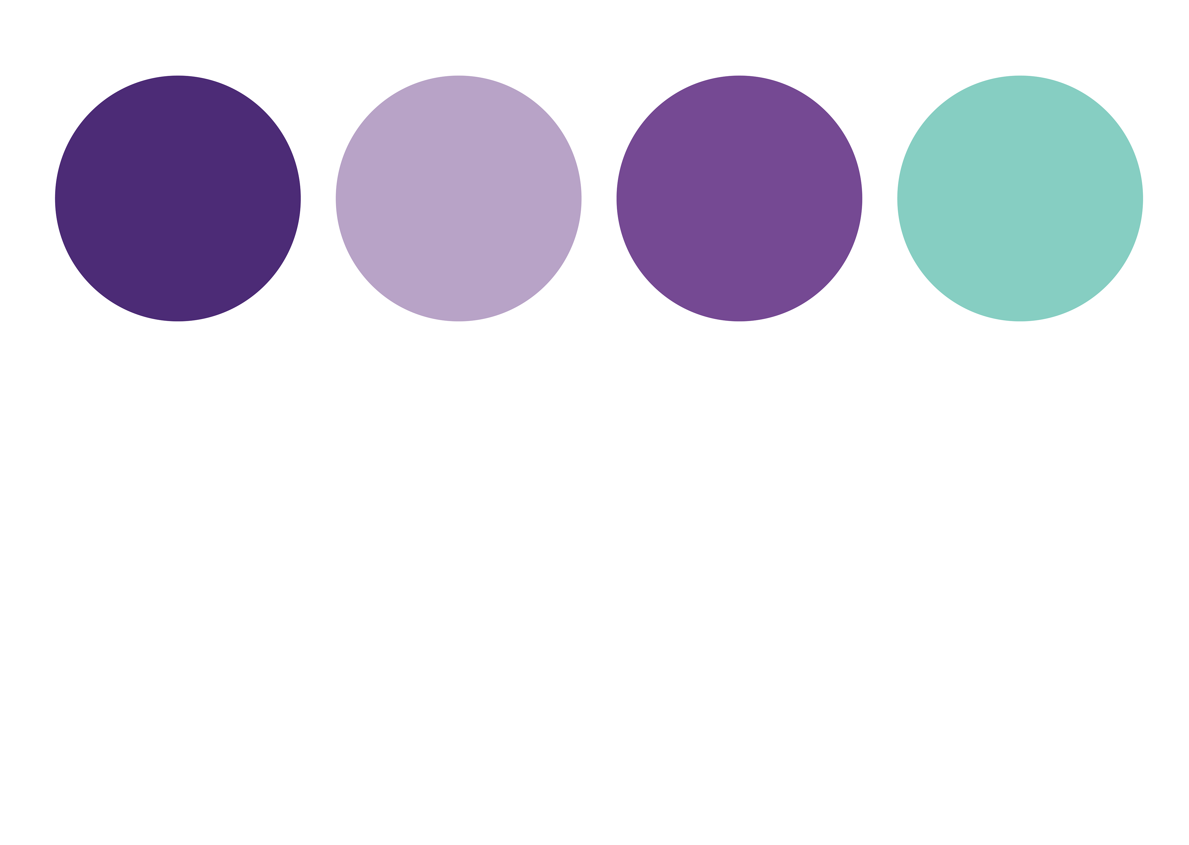
COLOR PALETTE AND TYPE PAIRING
While the logo was remade, the color palette remained the same for Amethyst Bay to have a sense of consistency throughout their branding from the old logos to the new logo and branding. The colors are a crystal clear representation of both the words "Amethyst" and "Bay" respectively and promote feelings of calmness, peacefulness, and serenity.
For the font pairings, originally only the Arial font was provided in their brand guidelines and so I made it my mission to find two other fonts to complement Arial and give more versatility to the brand itself instead of only using one typeface for all of their marketing and advertisement material.
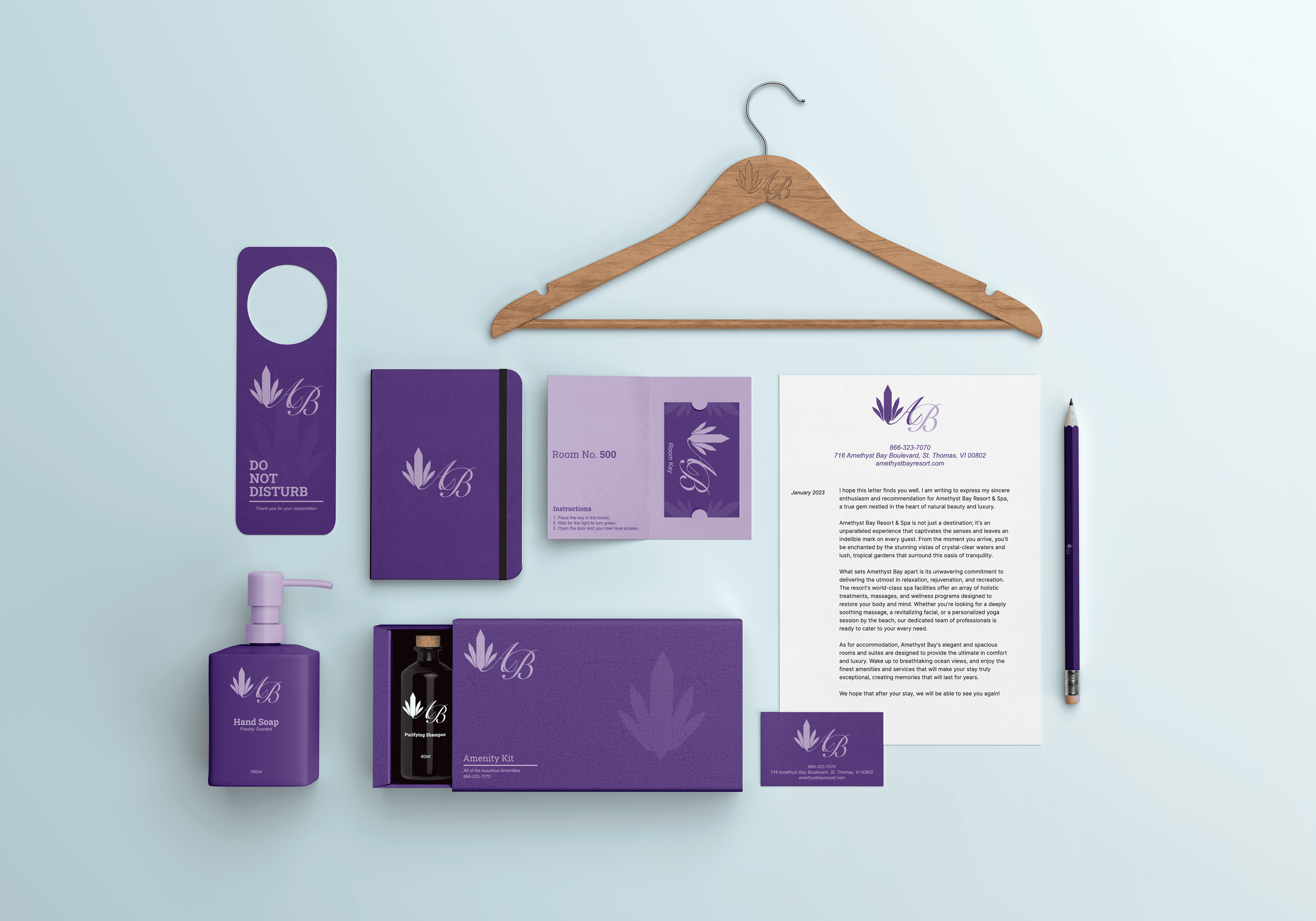
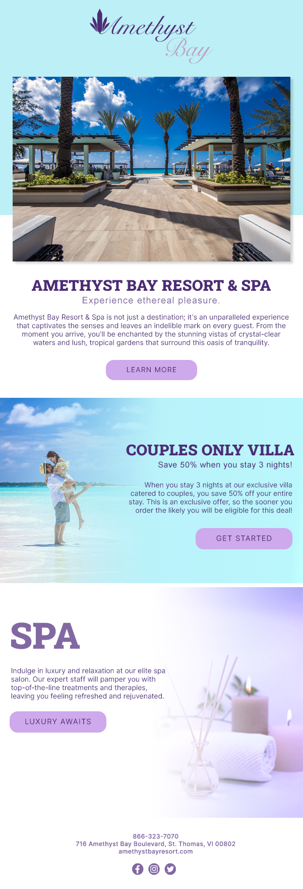
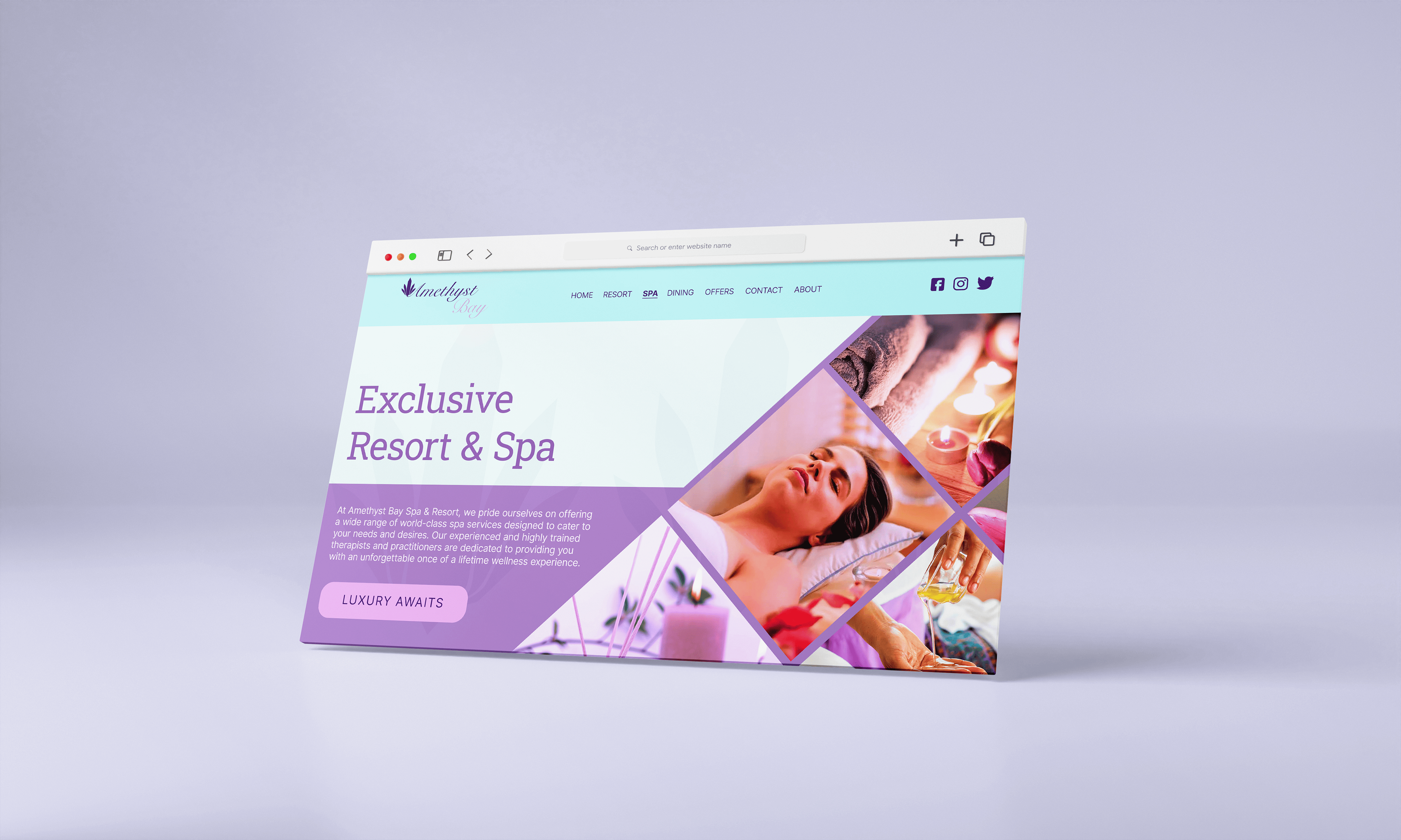
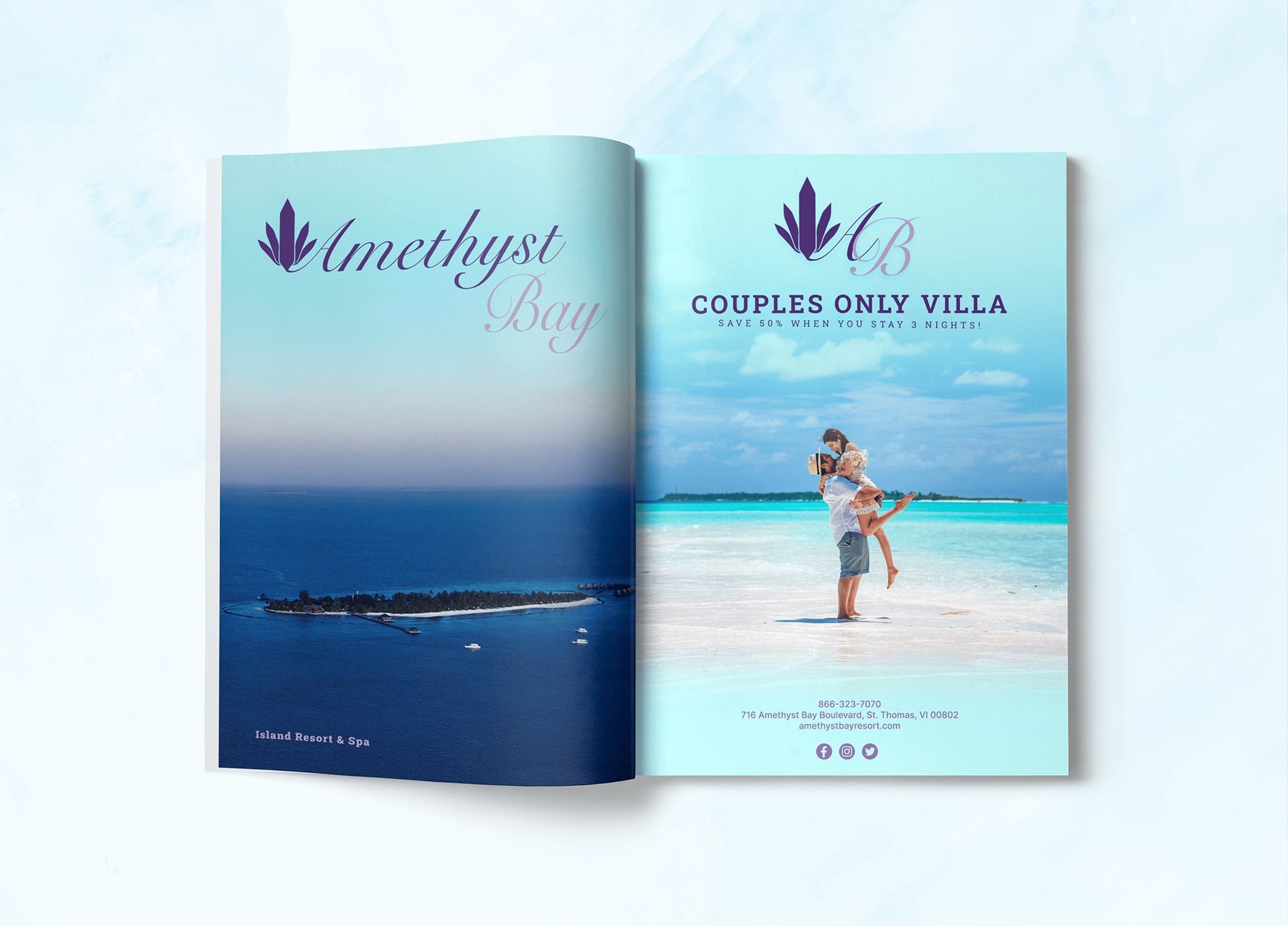
DELIVERABLES
(Marketing, Branding, Advertisement)
My main goal for all of the deliverables was to highlight the new logo designs and create a sense of cohesion throughout the brand palette so that Amethyst Bay as a brand identity still felt like Amethyst Bay just with an upgraded logo design and additional font pairings, all of which was added to complement each other, making each deliverable shine through in its own unique way.