CONMOTO
Conmoto is a new conceptual music-playing application destined to help newer artists find their footing in the music industry. With all the other apps focusing their efforts mainly on the Top 40 popular hits, Conmoto encourages and promotes underground and upcoming artists on their platform, placing them at the forefront of their application.
GOALS
Conmoto hopes to help and encourage upcoming artists by marketing them on their front page and inspiring a new audience of music lovers to discover new artists that aren't often showcased on other popular music applications. Conmoto is not focusing on who is popular already but rather focusing on talented musicians who feel need that boost to reach a new audience and grow their fanbase.
TARGET DEMOGRAPHIC
•Music lovers who love to explore new music and artists alike
•Musicians who are looking to grow and expand their audience
•All age ranges welcome from teenagers to middle-aged and elderly adults
•Music industry majors looking for an app that resonates and connects them with music
•Those who are tired of listening to what's popular on the radio and want more variety in music
ROLES
Logo Design
Brand Design
UI Design
Print Design
LOGO DESIGN
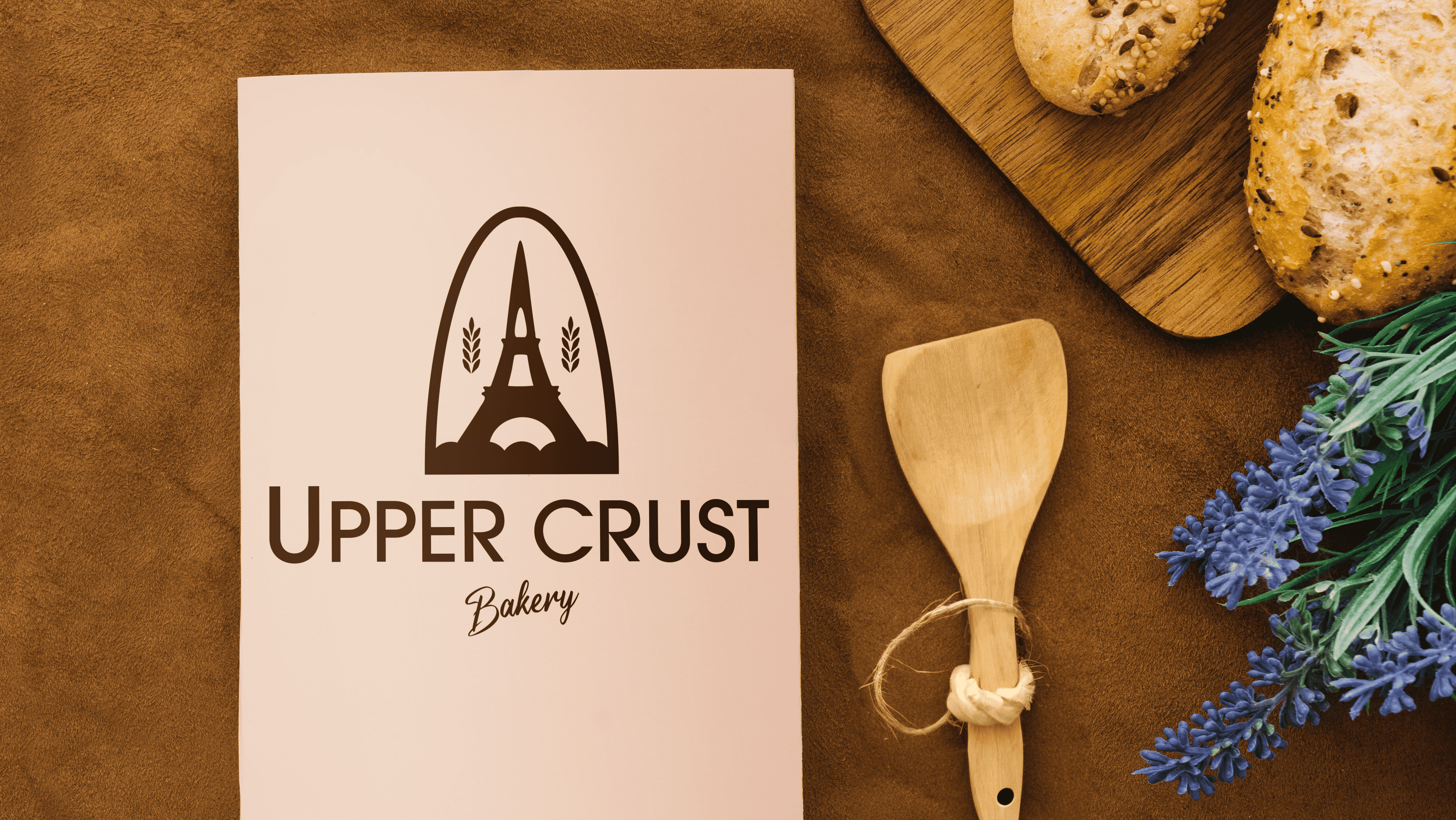
When designing the logo for Conmoto, I wanted to touch on what the word "Conmoto" means which is a term within music that means "with movement". This phrasing led to their tagline of "Music in motion" with the motion italicized to represent the motion portion. The actual logo itself is the C of the Conmoto logo with two smaller C's inside of it and this is to resemble sound waves in the shape of the C. The secondary O logo is to resemble sound waves similar to what you would picture coming out of a radio station antenna in the shape of the O in Conmoto.


COLOR PALETTE & FONT PAIRING
When choosing the colors for Conmoto, I wanted the color palette to exude fun, vibrancy, and liveliness. The first three colors resemble that notion and are very cohesive and paired together. The remaining three color choices are fun colors that both complement and contrast the first three to give the brand a bit more variety while still tying it together to create a cohesive brand identity.
For the font pairings, I wanted to make sure every font was legible to read on a mobile app, which is why I mainly selected san serif and slab serif fonts. I chose fonts that paired well with the logomarks and provided both the print and UI designs with a fun and easy-to-read experience. I italicized some of the words such as "motion" to resemble the motion part of the brand identity.

PRINT DESIGN
I highlighted the artists in a very fun and vibrant perspective using a variety of color palettes within Conmoto. I used a motion blur in the posters to resemble the "music in motion" portion that Conmoto stands for. For the other artists included, I decided to illustrate the first logomark as being the sound wave in the form of the "C" of Conmoto.
Regarding the merchandise design, I wanted to highlight the logomarks and market them as the staple of Conmoto much like how many other music companies do for their logomarks. I decided to use a variety of the first three colors in a "C" & "O" formation of the logomarks and the first two letters of Conmoto to create a fun and lively illustration that fully resembles the brand. For the VIP passes, I chose to use the more muted colors and resemble the logomarks in a much more unique setting, using them both as a foreground and background element.
Regarding the merchandise design, I wanted to highlight the logomarks and market them as the staple of Conmoto much like how many other music companies do for their logomarks. I decided to use a variety of the first three colors in a "C" & "O" formation of the logomarks and the first two letters of Conmoto to create a fun and lively illustration that fully resembles the brand. For the VIP passes, I chose to use the more muted colors and resemble the logomarks in a much more unique setting, using them both as a foreground and background element.


UI DESIGN
The UI Design was a combination of incorporating the logomarks and the first three vibrant colors in the color palette for the initial introduction to the application, including the app icon, opening screen, and log-in/sign-up screen, respectively. Once you are inside the app with your account, the highlight shifts to the artists and the playlists, encouraging the user to explore their favorite genres and listen to all kinds of different artist's music.